Characteristics of an effective logo!

An effective logo is critical when it comes to creating a brand for a business. I design a lot of logos for people and businesses but there are a lot of businesses who already have logos. You may be one of those businesses who have a logo and you absolutely love it but have always wondered if it is effective or not. You might not have a logo yet and your graphic designer is working on it and you want to know if it will be effective once finished. I have compiled a list of questions/characteristics of an effective logo that you can compare your logo to. Enjoy!
Characteristic #1: Is Your Logo Timeless?
An effective logo is a logo that is timeless and can adapt when the time changes. The question you can ask yourself to determine if your logo is timeless is, does it feel dated? Are there 1980 dropshadows on every aspect of the logo? Does your logo feel heavy in comparison to modern day logo design? Are there harsh gradients in the logo that go from red to blue or green to purple? A timeless logo is a logo that can stand the test of time. I asked a series of questions to see if it is up to date but the real question is whether or not it will remain up to date moving forward.
Of course, no one knows what the future will look like when it comes to logo design but your logo will have to be able to adapt. This is why everyone preaches simpler is better. A simple logo usually passes the test of time as long as it is intentional. A timeless logo is a flexible logo that can be updated in a way that doesn’t change the logo. Think about the big players, Coca-cola, Google, Disney, Nike, etc. These logos have been the same for a lot of years but they update slightly every 5 years or so to keep up with time. That is the flexibility that your logo should have. Strive to remain relevant. Which brings us to the next characteristic.
Characteristic #2: Is Your Logo Relevant?
An effective logo must be relevant in two different ways. Is your logo relevant to your industry? And is your logo relevant to your customers/targeted audience? To be honest, most people are in business to solve a problem and with that solution they have to make money. Relevancy is the window to that money.
Industry relevancy is a key component to think about for the simple fact of staying competitive. Are your colors relevant? Are your fonts relevant? Do these elements match the industry you are in? An example of bad industry relevance is using the a pink script font for your logo when you sell power tools. Now just because Home Depot is orange doesn’t mean match home depot’s colors. Just because Lowe’s has a bold font doesn’t mean match Lowe’s. This simply means, will your logo be able to stand up against these big partners and compete? If not it is time for a change and if it does you need to check customer relevancy.
Customer relevancy is how your targeted audience perceives you. If you own a flower shop and you are going after women over 50 who own a garden, a chrome logo in a bold font like Ram Trucks is not the way to go nor is it industry relevant. You might be wondering if you can be one or the other when it comes to relevancy, and the answer is yes. An industry relevant logo could be a toy doll company, similar to Barbie, except for boys whose colors are blue instead of pink. Blue is not relevant to the “Barbie” industry but it is relevant to the customer you are going after.
Customer Relevance allows you to make money, industry relevance allows you to compete. Make sure your effective logo has both of these characteristics.
Characteristic #3: Does It Pass The One-Color Test?

The Wrong Way
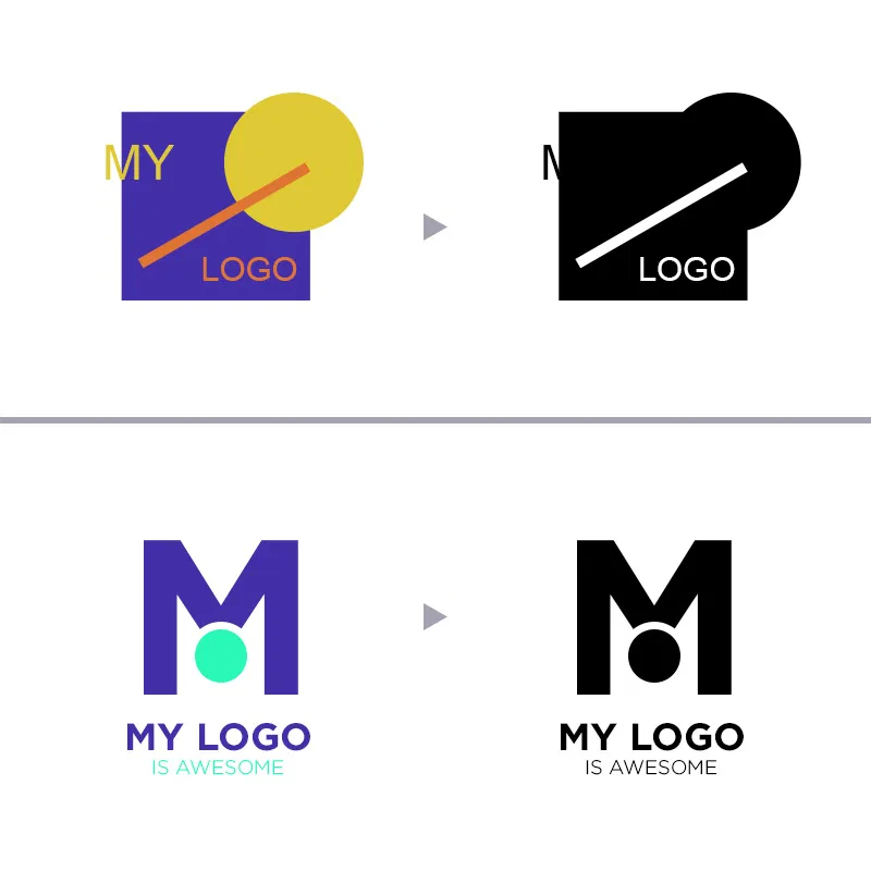
An effective logo must pass the one-color test. Make all the elements of your logo the same color, is it still the same logo or does it look weird? You can see in the top two pictures the logo on the left is in full color and aside from the text hanging off the edge it is “somewhat” presentable. What makes this logo a bad one is when you put it in one color. You have to make decisions on what’s color and what’s negative space and either way the logo does not look the same as the first.
The Right Way
The bottom logo all of the elements are clear individual elements and when put to the test those elements remain the same and the logo is still the same. This one-color test is a small one but can take some time to apply to a logo which is why it is important to start designing your logo in one color to begin with and add color last.
In Conclusion
An effective logo is not difficult to create as long as you have a professional desiging your logo. You usually find an ineffective logo when a logo is done by your little cousin’s friend who draws well that you allowed to create your company logo. Creating an effective logo for your business is something that is always overlooked in the beginning stages of business but eventually is valued the more years you are in business. You can do it right the first time and pay a professional or you can go the cheap way and pay a small amount 10 times in 10 years because you and your customers aren’t fond of the look your company is perceiving.
If you have any questions on whether or not your logo is effective feel free to comment and I will review your logo for free! Otherwise I’m curious to hear about your thoughts on what you consider an effective logo!
👍🏾 Thanks for reading.