

Thoughts and analysis of Dunkin’s New Brand!
So before we start, Dunkin’s new brand is dominant and well worth the rebrand!
It is awesome for a number of reasons and I will go through them here in a second. Before that though I want to say that I have never been a fan of Dunkin Donuts and don’t think I will become one even after the new brand rolls out. So my thoughts on this new brand is completely unbiased. Just know I know a good logo/brand when I see one.
The Name Change
The most obvious change to Dunkin’s new brand is the name change! This is the best decision ever from a design standpoint, brand positioning standpoint, and a business standpoint. Everybody knows Dunkin donuts sold donuts and coffee, and that’s it. But in reality, they sell a lot more than that, just breakfast in general. By removing the “Donuts” from the end of their name it allows them to market other products a lot easier.
Imagine a commercial that runs 10 times a day and over and over it says “New Coffee only at Dunkin Donuts”. The focus is on coffee and the focus is on donuts. All the coffee lovers remember “coffee” and they run to their nearest Starbucks or McDonalds. Then everyone else remembers donuts. Everyone on the planet knows donuts are not good for you and you probably shouldn’t be having one so now you have disconnected half the population when trying to sell your new coffee.
Fast forward to today, and you will find that same campaign read as Dunkin coffee. One focus and that is coffee sold by the brand Dunkin. Throw an offer on it and now people are looking up the closest Dunkin location near them. (I actually have no idea where a Dunkin location is near me)
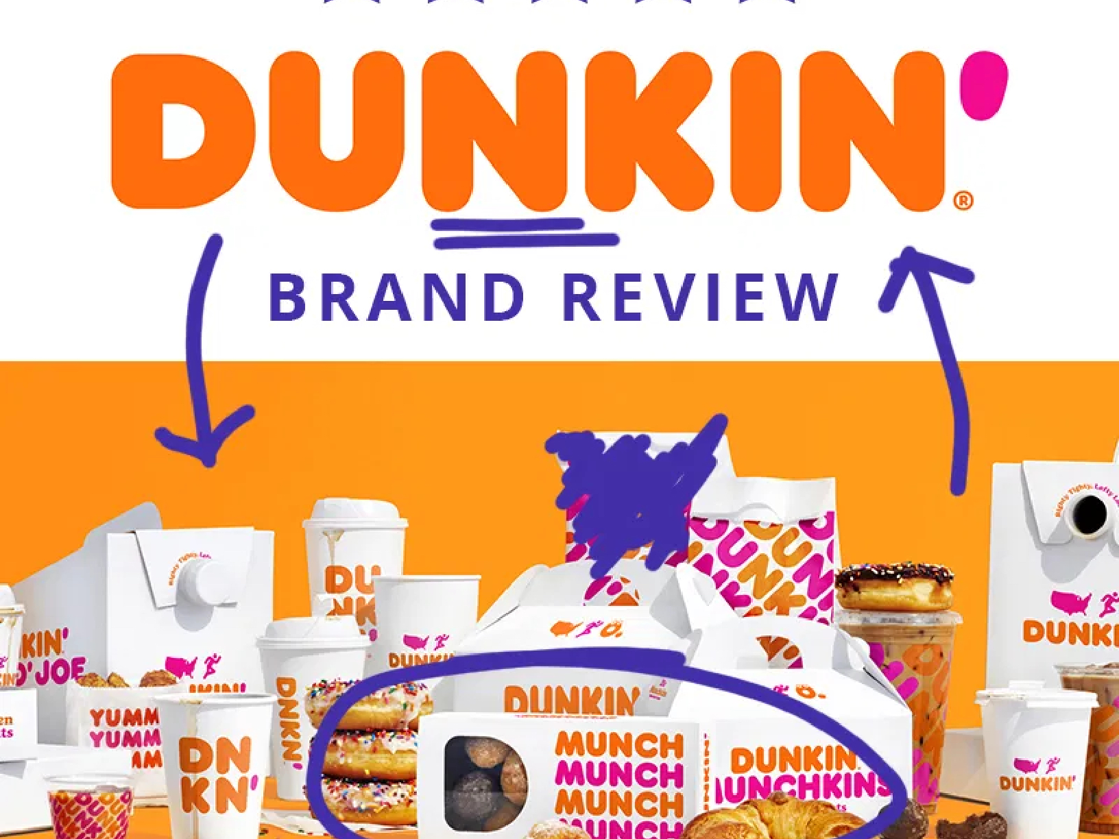
![]()
The Branding Elements Update... Or Not
Even though I am not a fan of Dunkin, I am very familiar with the Dunkin Donuts brand. Pink, orange, and they sell donuts. One thing they did extremely well with this brand refresh is keep the branding the same. They did not change the colors. They did not change the font, they kept what was working for them, as is. A lot of times when companies decide to refresh or upgrade their logo they do a complete overhaul and destroy their years of branding.
If you notice on their current website, they still show their old branding on some pictures and they still refer to themselves as Dunkin donuts. I am sure that is with intent to connect those who were tied to the older brand. That is the way it should be done. You would think, do a way with the old and in with the new. All that means is remove old customers and let’s get millenials. Unfortunately, it does not work that way.
The Application
Dunkin’s new brand was well done but most importantly, I think, is how they applied the brand throughout marketing material and packaging. I’m not a huge believer in “bigger is better” but in this instance, I am. The way they show the logo on the tallest cup is nice and it’s easy, “just slap the logo on the cup”! The shorter cups don’t get a smaller logo, they get a modified version of the logo that still reads “DNKN”. For the medium cup its DNKN inline and for the shortest they stack the “DN” and the “KN” which still reads the same but allows the logo to be bigger. Well DUN…lol
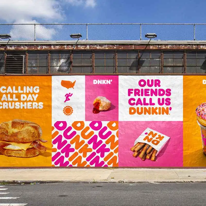
To bring home the application, I am going to circle back around to the versatility of Dunkin’s new brand name. Dunkin sells bagels, coffee, sandwiches, hash browns, and more, and they can keep the name the same and show the product they are offering underneath. This kind of versatility allows them to sell anything and their name doesn’t hurt them. The application of Dunkin’s new brand is superb on the packaging, the website, the marketing, and anywhere else you see it. Versatility is a huge characteristic when you are talking about how effective a logo/brand is. They hit it right on the head with this one!
In Conclusion
Dunkin’s new brand gets a 5 out of 5 for this refresh. Between the name change, the brand update, and the brand application, they all were done intentionally for a number of reasons. Good job JKR Global for this update, another brand to make America’s Branding Great Again. Dunkin Done.
If you enjoyed this brand review feel free to comment, like, and/or share! Also, if you would like your brand or logo to be reviewed by yours truly I would be happy to at no charge! I enjoy reviewing brands because it is a passion of mine that I might giveaway forever. Feedback is welcome and until next time. See ya!
👍🏾 Thanks for reading.