

A logo rebrand for Brownland Properties, a real estate agency.
The Brief/Request
We are a real estate agency, our clients are local reputable developers, which develop mid- high end housing project , we are to market and sell their projects to potential buyers. We want to rejuvenate and rebrand our branding, to reflect our company as profession, young , and dynamic. Lay the foundations for better profiling, improved brand perception & more interest from potential recruits our main goal for this rebranding exercise is:
- to attract younger talents to join us as Sales Agents
- to attract buyers.”
My Approach
This logo rebrand was a fun project to work on. I mocked up some ideas in my sketchbook until I landed on this final design and then brought it to life with color. I felt like a lot of real estate logos are very templated showing a house in the logo but I wanted to get this across without being so blunt.
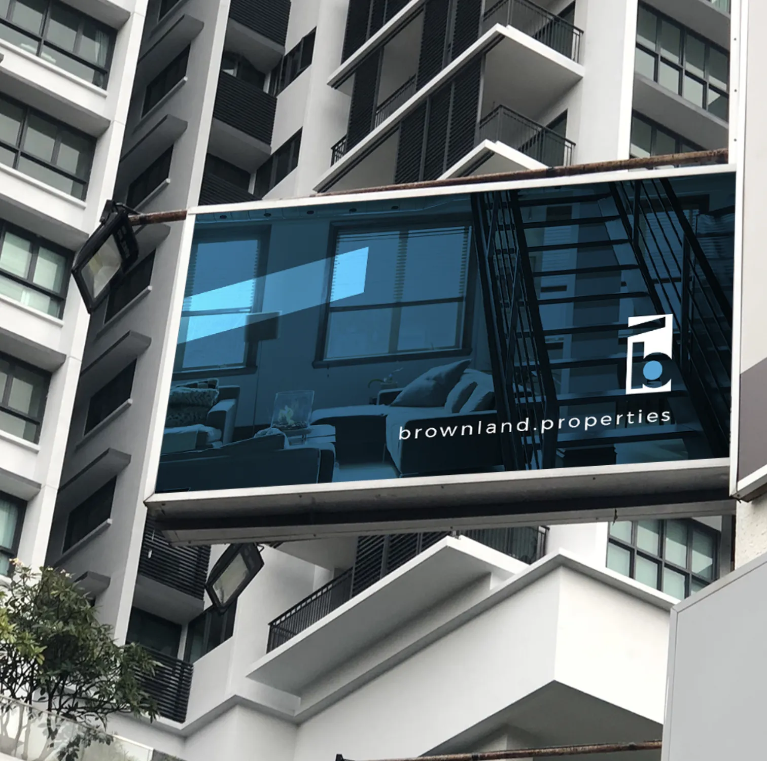
The Icon
The icon shows the letter “b” of course but the thick line above it represents a roof of a house/building. This is a very abstract version of a roof that I think works perfectly for a brand identity element as you can see in the billboard and business card.
![]()
The Typeface
The typeface for this logo rebrand I wanted to keep very modern and simple for the simple fact that the industry is not playful or organic. It is a very corporate type of industry but at the same time reaching a younger market the logo has to be extremely simple.
The Color
We all know the color blue is overly used in logos, but at the same time when it calls for it, I believe it is necessary, which is the primary reason there are so many blue logos. The first thought of course was to go with a brown logo hence the name of the company is brownland, but there existing logo was in brown and they felt it reached an older audience. So the first thing to do is to disconnect that audience by reintroducing a new look and feel that invites a new audience.
The Conclusion
This was chosen as a winner, and this company will be unveiling their logo rebrand at the beginning of next year. I always have fun designing logos but its always more fun when it becomes a winner of a design contest. Let me know your thoughts on this real estate logo rebrand in the comments section! Thanks.
If you are interested in getting a custom logo rebrand for your new or existing business, be sure to contact me today!
👍🏾 Thanks for reading.